 July 2026
Glam Nails
Overview
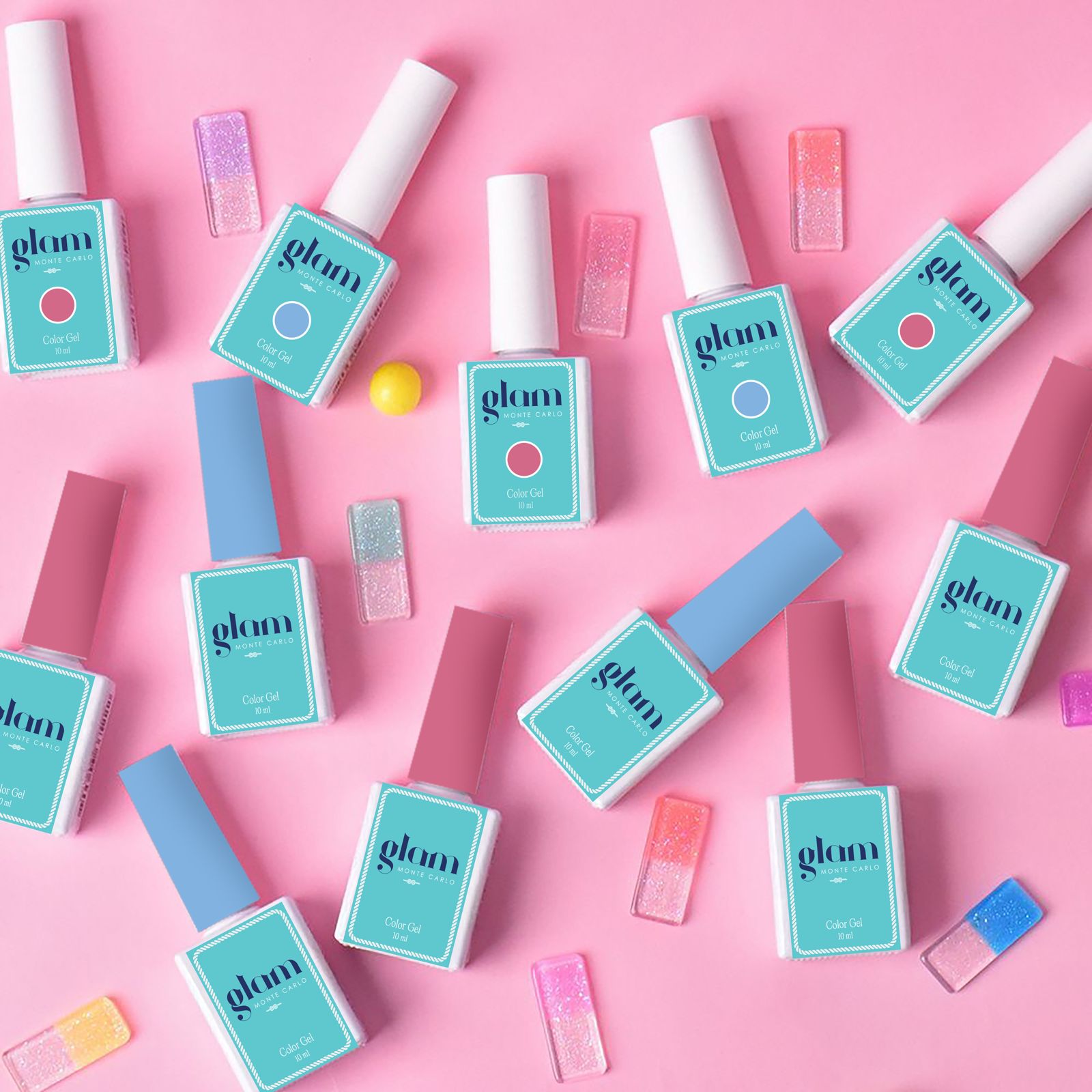
A.Privè Marketing was commissioned to develop the logo and packaging concept for Glam, a professional gel polish brand. The objective was to create a clean, recognizable, and highly functional visual identity that would appeal to both nail professionals and end consumers.
The project was guided by the principle of simplicity and clarity. From the outset, the goal was to develop a minimalist design system that would allow users to quickly identify the brand, navigate the product range, and easily distinguish between shades.
A key technical requirement was the use of opaque packaging, as gel polish products cannot be properly stored in transparent containers due to their sensitivity to light. The packaging therefore needed to combine practical functionality with a modern and aesthetically refined appearance.
About the Client
The visual concept was built around clean lines, minimal graphic elements, and a bold, highly visible logo designed to strengthen brand recognition both on retail shelves and in professional salon environments. Particular attention was given to the interaction between the brand identity and the shade identification system. While maintaining a strong and consistent visual identity, the logo was designed to work harmoniously alongside a wide range of color indicators without competing with the product's shade information.
A.Privè Marketing developed a contemporary typographic logo that reflects the professional positioning of the brand while ensuring excellent readability across packaging formats and marketing materials. The design language emphasizes clarity, functionality, and confidence, creating a strong foundation for future brand growth.
The result was a cohesive visual identity and packaging system that successfully combines aesthetics, usability, and commercial effectiveness. The new design provided Glam with a distinctive and professional brand image while enhancing product navigation and creating a clear visual standard across the entire product line.
-
1.
Brand Strategy
The objective: a clean, recognizable, and highly functional visual identity appealing to both nail professionals and end consumers.
-
2.
Design System
Development of a minimalist design system guided by the principle of simplicity and clarity.
-
3.
Logo Development
A contemporary typographic logo reflecting professional positioning with excellent readability across packaging formats and marketing materials.
-
4.
Packaging Design
Opaque packaging combining practical functionality with a modern and aesthetically refined appearance.
-
5.
Visual Identity System
A cohesive visual identity and packaging system successfully combining aesthetics, usability, and commercial effectiveness.